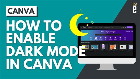
When it comes to designing user interfaces, particularly in the context of web development, the trend towards dark mode has been on the rise. This aesthetic preference not only caters to user comfort, especially in low-light environments, but also offers an opportunity for creative expression and design differentiation. For developers working with the HTML5 canvas element, incorporating dark mode can enhance the visual appeal and usability of their applications. Here are five tips for effectively utilizing dark mode with canvas elements.
Key Points
- Understanding the Basics of Dark Mode: Start by grasping the fundamental principles of dark mode design, including color selection and contrast.
- Choosing the Right Colors: Select a palette that is both aesthetically pleasing and readable, considering the importance of contrast between background and foreground elements.
- Implementing Dark Mode with Canvas: Learn how to apply dark mode to your canvas elements through CSS and JavaScript, including dynamic switching between light and dark themes.
- Optimizing for Accessibility: Ensure that your dark mode design is accessible by maintaining sufficient color contrast and providing options for users with specific needs.
- Testing and Feedback: Test your dark mode implementation across various devices and browsers, and be open to user feedback for continuous improvement.
Navigating the Basics of Dark Mode

Before diving into the specifics of implementing dark mode with canvas elements, it’s essential to understand the underlying principles of dark mode design. Dark mode, also known as night mode, is a display setting for user interfaces that uses light-colored text and other elements on a dark-colored background. This design approach can reduce eye strain in low-light conditions, conserve battery life on OLED displays, and offer a sleek, modern aesthetic. The key to successful dark mode implementation is achieving the right balance of colors to ensure readability and visual appeal.
Color Selection and Contrast
The choice of colors is critical in dark mode design. A well-designed dark mode interface typically features a dark background (often a shade of gray or black) and light-colored text and accents. The contrast between these elements must be sufficient to ensure readability. The Web Content Accessibility Guidelines (WCAG 2.1) provide specific ratios for contrast between text and background, which are useful guidelines for dark mode design. For instance, the contrast ratio for normal text should be at least 4.5:1, while larger text (24-point or 19-point bold) requires a minimum ratio of 3:1.
| Element | Dark Mode Color Suggestion | Contrast Ratio |
|---|---|---|
| Background | #2f2f2f (Dark Gray) | - |
| Text | #ffffff (White) or #cccccc (Light Gray) | 4.5:1 or higher |
| Accents | #4CAF50 (Green), #03A9F4 (Blue), or similar | 3:1 or higher |

Implementing Dark Mode with Canvas

Implementing dark mode with canvas elements involves a combination of CSS for styling and JavaScript for dynamic control. You can apply dark mode styles to your canvas elements by defining a dark theme in your CSS and then switching between light and dark themes using JavaScript. This can be done by adding or removing a class that defines the dark mode styles.
For example, you can define your dark mode styles in CSS as follows:
.dark-mode {
    background-color: #2f2f2f;
    color: #ffffff;
}

.dark-mode canvas {
    border: 1px solid #555555;
}
And then apply these styles dynamically with JavaScript:
function toggleDarkMode() {
    document.body.classList.toggle('dark-mode');
    // Additional logic to adjust canvas elements or other parts of the UI
}
Dynamic Theme Switching
Dynamically switching between light and dark themes can enhance user experience by allowing users to choose their preferred theme or automatically switch based on the system’s theme preference. This can be achieved by listening for changes in the system’s theme preference and adjusting your application’s theme accordingly.
Optimizing for Accessibility
Accessibility is a crucial aspect of any user interface design. When implementing dark mode, it’s essential to ensure that your design is accessible to all users, including those with visual impairments. This involves maintaining sufficient color contrast, as mentioned earlier, and providing options for users who may need them, such as the ability to override your application’s theme with their system preferences or a custom theme.
Additionally, consider the colorblind mode or high contrast mode for users who need it. These modes can be implemented by providing additional theme options or by dynamically adjusting colors based on user preferences.
Testing and Feedback
Finally, testing your dark mode implementation across various devices, browsers, and operating systems is vital to ensure compatibility and identify any issues that may arise. Be open to user feedback, as it can provide valuable insights into improving your application’s usability and accessibility.
How do I ensure my dark mode design is accessible?
+To ensure your dark mode design is accessible, focus on achieving sufficient color contrast between background and foreground elements, and provide options for users with specific needs, such as system theme preference overriding or custom themes.
Can I dynamically switch between light and dark themes based on user preference?
+Yes, you can dynamically switch between light and dark themes by listening for changes in the system's theme preference and adjusting your application's theme accordingly using JavaScript and CSS.
What are the benefits of using dark mode in my application?
+The benefits of using dark mode include reduced eye strain in low-light conditions, potential battery life conservation on OLED displays, and a modern, sleek aesthetic that can enhance user experience.
In conclusion, incorporating dark mode into your canvas-based applications can be a powerful way to enhance user experience, provided it’s done with careful consideration of design principles, accessibility, and user preferences. By following these tips and staying open to user feedback, you can create applications that are not only visually appealing but also usable and accessible to a wide range of users.


